Popsockets
Overview
With their declared mission of bringing “fun into the world", Popsockets is a cell phone accessory company widely known for their pop out phone grips. Over the years, they have added many innovative accessories to their repertoire but have not redesigned the website navigation system to effectively showcase their collection. This is an unsolicited website redesign, primarily focusing on the navigation system to enhance the users' experience.
Methods
Research, User Flows, Sitemaps Information Architecture,
Sketching, Wireframing, UI, Prototyping
Context
Course Assigned
Solo Project
Tools
Optimal Card Sort
Adobe XD
Miro
Timeline
10 Days
The Challenge
The current Popsockets website has a cluttered navigation system that does not guide prospective customers to browse the site effectively.
The Approach
Recategorize and organize content for customers to intuitively navigate and add additional filter categories to streamline the browsing process.

Research:
After interviewing 6 users who were currently using or have used pop grips and innovative phone accessories,
I found that 4 of 6 interviewees have browsed the Popsockets website at some point without making a purchase. I further synthesized the interview data in an affinity map, organizing data by topics identifying critical goals and frustrations. The insights compiled through this process culminated in the creation of a user persona that represents Popsocket’s primary audience.

Popsockets User Persona
Plan:
My focus was to create a framework to ease and excite Mila’s journey through the website. After creating a content inventory of the Popsockets products, I conducted an open card sort of those contents and, from the results, discovered a more intuitive way to organize and categorize pages for the sitemap. I also created two user flows to streamline the navigation further on the sitemap.
Additionally, the user flows served as a tool of clarity as I sketched multiple screen states to better guide the wireframing and design process. The current Popsockets website tucks all its items in categories under “Shop.” Furthermore, clicking on the outlet tab will take you to sale items; however, the user research proved that users did not consider the outlet tab to contain sale items.

current popsockets navigation
The New Design:
In the new design, the global navigation now features six new categories, the first five based on the card-sorting data, and the Sale category replacing the former Outlet option to clarify where users can find items on sale.

redesigned homepage and updated navigation bar
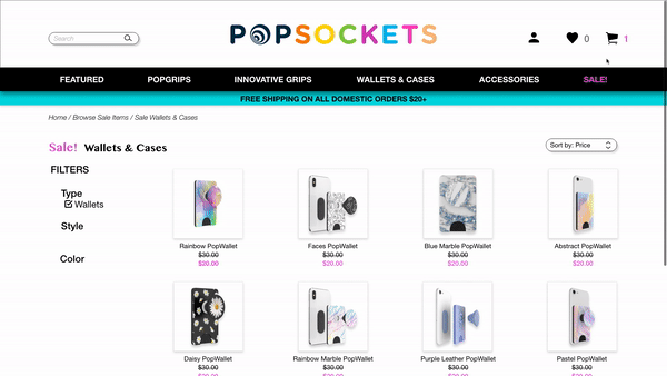
“I wish I could just sort this all by color!”
Popsockets current website only offers two filtering options for browsing customers. User research proved the options, labeled category, and type, to be synonymous and unclear. Among the users interviewed, 90% expressed a need to filter by color and style in addition to the type of item.

prototype gif of new filter by color feature
Finally, I wanted to address Mila’s last goal and frustration. She cannot click on an item in her cart on the current site and view the item page. Instead, Mila must spend extra time searching for the item.
The new design includes a new feature enabling users to click on items in their cart to review an item quickly before checking out.
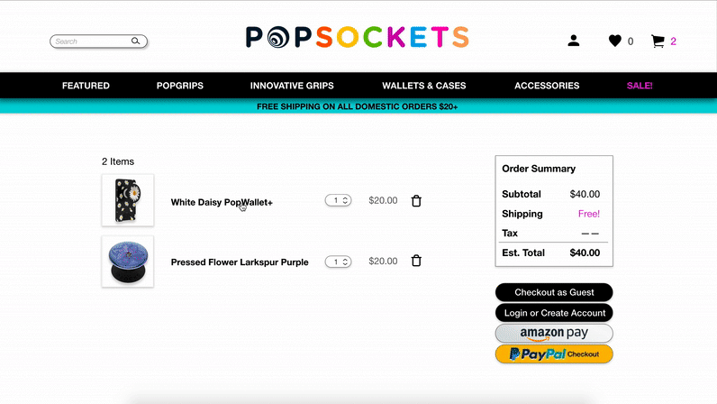
prototype gif of click to item on cart
Testing:
Once the first iteration of the design process was complete, I conducted 6 user tests involving 3 tasks.
Task 1 Browse through the site with the intention
of buying a purple PopGrip.
Task 2 Add a wallet on sale to your cart.
Task 3 Complete the checkout process as a guest.
SUS 77.5
User's found the newly updated navigation straightforward and easy to use.
-
The newly added color filter was effectively used by 6/6 of the users for the first task
-
5 of 6 users filtered by type for the second task.
-
On the third task, 3 of 6 users clicked on an item in their cart for review before completing the checkout process.
Ultimately, the testing feedback proved the navigation to be effective and called for two minor changes involving the cart, which were incorporated into the final design:
1
4 of 6 users expected to see the number of items in their cart next to the shopping cart icon
2
3 of 6 users wanted a quick view of items in their cart, without navigating away from the page they were browsing.
Final Iteration
In addition to adding an indicator aside the cart icon to reflect the number of items in the user's cart, I recreated the cart to slide in as an overlay that can be referenced on any page. This gives users quick access to their cart and allows the checkout process to begin there.
second iteration with updated cart view